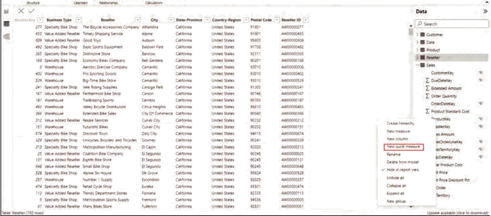
Identify Microsoft cloud services for real-time analytics
In an age where decisions must often be made at the blink of an eye, the role of real-time analytics has become paramount. The ability to rapidly sift through vast streams of data, distill meaningful insights, and act on them instantaneously can often mean the difference between seizing an opportunity or missing it entirely. But beyond the buzzwords, what does real-time analytics truly entail, especially when you’re navigating the vast offerings of the Azure ecosys-tem? This section will guide you through Azure’s real-time analytics technologies, demystifying their capabilities and applications and setting you on a course to harness their full potential. From understanding the prowess of Azure Stream Analytics to grasping the nuances of Azure Synapse Data Explorer and Spark structured streaming, you’re about to get to the heart of instant data processing and analytics.
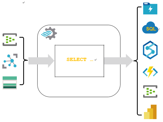
■ Stream processing platforms: At the center stage of real-time analytics are stream processing platforms. A stalwart example is Azure Stream Analytics, which you can use to ingest, process, and analyze data as it flows. To visualize its power, consider moni-toring a vast power grid, instantly detecting surges, and redirecting power to prevent outages. Just like the grid managers, you can harness Azure Stream Analytics to react immediately to your business’s data.
■ Azure Synapse Data Explorer: This isn’t just another tool—it’s your window into the massive streams of data you’re dealing with. With Azure Synapse Data Explorer you can
120 CHAPTER 4 Describe an analytics workload on Azure
query, visualize, and explore your data in real time. It’s like having a magnifying glass over a rushing river of data, where you can pick out and examine individual drops (or data points) as they flow by.
■■ Spark Structured Streaming: An integral part of the Apache Spark ecosystem, Spark Structured Streaming facilitates scalable and fault-tolerant stream processing of live data streams. Imagine standing amidst a bustling stock market, with traders shouting orders and prices fluctuating wildly. Now, imagine you could process, aggregate, and make sense of all that data in real time. That’s the magic Spark Structured Streaming brings to the table. Figure 4-16 shows you streaming lines of data converging into structured blocks of information.
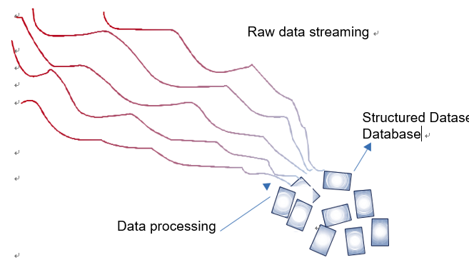
FIGURE 4-16 Streaming data converging into structured datasets
■■ Message brokers: Azure Event Hubs stands tall as a premier message broker. As you navigate the labyrinth of real-time data, you’ll realize the critical role of these brokers in ensuring data is delivered reliably and promptly to the systems that process them. It’s the backbone, the silent carrier ensuring every piece of data reaches its destination.
■■ NoSQL databases: In the realm of real-time data, traditional databases can become bottlenecks. This is where powerhouses like Cosmos DB shine. Designed for breakneck speeds and unmatched scalability, they provide the storage that might be required for the deluge of real-time data. If you’ve ever wondered how global social media platforms can show trending topics within seconds of an event unfolding, NoSQL databases are a big part of that answer.
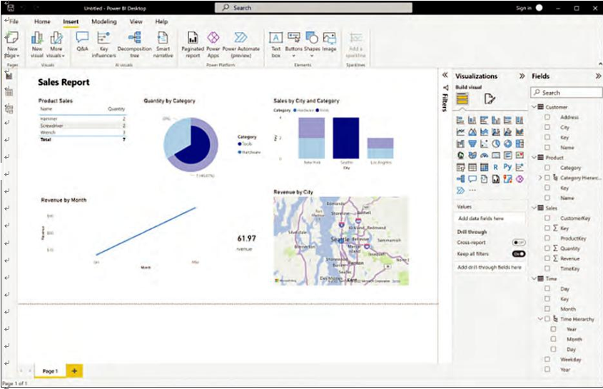
■■ Data visualization tools: The journey from data to decision is completed when insights are visualized and made actionable. Power BI serves as a beacon here, integrating with real-time analytics platforms to deliver live data dashboards. These aren’t just numbers and graphs; they’re the pulse of your operations, showcased in real time.
The ecosystem of real-time analytics is vast and ever-evolving. As you delve deeper, be pre-pared to witness the symphony of technologies working in unison, each playing its unique note in the grand composition of real-time insights. Each technology, be it Azure Stream Analytics,
Skill 4.2 Describe consideration for real-time data analytics CHAPTER 4 121
Azure Synapse Data Explorer, or Spark Structured Streaming, has its own nuances, applications, and potentials.